- 股票掌故
- 香港股票資訊
- 神州股票資訊
- 台股資訊
- 博客好文
- 文庫舊文
- 香港股票資訊
- 第一財經
- 微信公眾號
- Webb哥點將錄
- 港股專區
- 股海挪亞方舟
- 動漫遊戲音樂
- 好歌
- 動漫綜合
- RealBlog
- 測試
- 強國
- 潮流潮物 [Fashion board]
- 龍鳳大茶樓
- 文章保管庫
- 財經人物
- 智慧
- 世界之大,無奇不有
- 創業
- 股壇維基研發區
- 英文
- 財經書籍
- 期權期指輪天地
- 郊遊遠足
- 站務
- 飲食
- 國際經濟
- 上市公司新聞
- 美股專區
- 書藉及文章分享區
- 娛樂廣場
- 波馬風雲
- 政治民生區
- 財經專業機構
- 識飲色食
- 即市討論區
- 股票專業討論區
- 全球政治經濟社會區
- 建築
- I.T.
- 馬後砲膠區之圖表
- 打工仔
- 蘋果專欄
- 雨傘革命
- Louis 先生投資時事分享區
- 地產
Random Tags
Ztrader – price information overlay 港股博弈
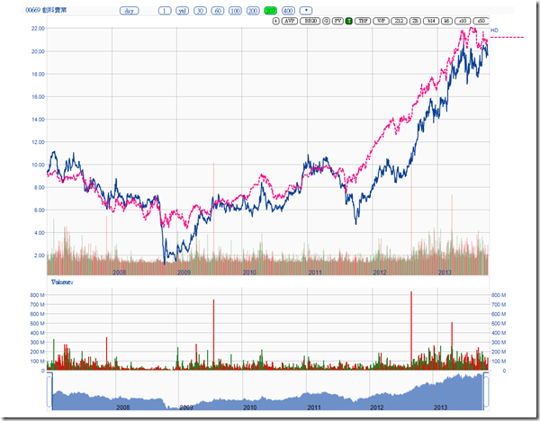
http://clcheung.wordpress.com/2013/10/17/ztrader-price-information-overlay/Ztrader is now capable of adding other stocks or user defined data on top of a chart, for example, # 2333′s corresponding A shares and average monthly sales information:
# 1818 , with Gold price, on relative scale:
Note that some information has to be plotted with relative scale or same scale.
# 0669 with Home Depot
Most important, the information is stored separately for each stock, no need to re-enter next time visit the stock again.
Ztrader – Moving Average (2) 港股博弈
http://clcheung.wordpress.com/2013/10/17/ztrader-moving-average-2/While Moving Average is a very good tool, it suffers when market situation changes. If the price is changed rapidly with a lot of noises, the MA may generate wrong trading signals.
Many adaptive methods had been created, it tried to vary the length of the moving average to better cope with the market situation. Kaufman’s moving average, KAMA, is based on the concept that a noisy market requires a slower trend than one with less noise.
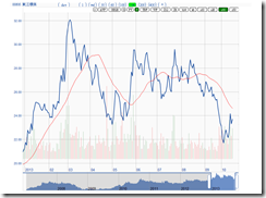
Look at this stock with 10day SMA:
20 day SMA:
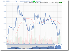
30 day SMA:
50 day SMA
KAMA:
KAMA seems able to follow the trend closely but less affected by the minor noises. It seems as smooth as a 50 day SMA at the same time follow the major price trend more timely.
It needs more verification on actual trading performance. It looks better than it performs, from my observations.
Ztrader – Trading Decisions 港股博弈
http://clcheung.wordpress.com/2013/10/19/ztrader-trading-decisions/How do you decide to trade ? Give some examples:
Fundamentals
F1 – US bond yield going up, bet on # 0945
F2 – Coal price keep dropping, bet on electricity sector
F3 – Q3 result announced, out of expectations
Event
E1 – placement, market overreacted
E2 – IPO
E3 – Insider keep buying (selling)
E4 – special events (special dividend, change of ownership, injection of assets, …)
Other people’s advices, rumors
R1 – Financial actors, ibanks, newspaper, paid services, friends, famous blogger, sing good
R2 – insider information
Market situations
M1- market panic, 80% stocks oversold
M2- market too hot, too many 52 weeks new high stocks
Relative valuations
V1 – Corresponding sector is strong in US, HK is behind
V2 – stocks in a particular sector very behind
V3 – sector is relative behind compared with other sectors
TA
T1 – your indicators give a signal
T2 – a stock making new high / new low
Or, you would mix the above, say:
F2 + T1, you know the electricity sector shall be good on lower coal price, but you want to wait for the best time to enter.
M1 + T1, you know oversold situation can last long, you want to avoid risk of early entry.
V2 + T1, you don’t know the reason why that stock is so behind, you don’t want to be trapped. A famous example is # 0246, which is very behind before gameover.
F3 + T1, you know the result looks good, but you want to confirm the market reaction first.
===
So is the above common trading decisions you want to make everyday ? Part of Ztrader is built to support the above decision processes. I don’t want to press 10 keys to find out which stock in a sector is behind. I don’t want to go to HKEX to search if an insider is selling or buying a stock recently, I want it display on screen immediately. I don’t want to check how Home Depot performed daily when I own 669, I want it display immediately. Part of Ztrader is just to integrate available data together to help making a trading decision.
Other than data integration, how do you know if a particular TA indicator is a good indicator for your trade decision ? What is the historical performance ? Can you tell if trade on a particulr oversold signal can give you how much return on average ?
Another part of Ztrader is trading system. To build a sound trading system, one may have to go through a design, testing, performance evaluation, risk evaluation, and implementation cycle. Trading system is a much bigger topic, will share more later, if it can be shared.
Ztrader – Linear Regression Channel 港股博弈
http://clcheung.wordpress.com/2013/12/03/ztrader-linear-regression-channel/A linear price channel (Raff Regression Channel) is something easy to interpret for ordinary traders. Especially for some stable and trending stocks, like # 1382:
# 2343
These trend lines can be semi-automatically created. The center line is created by linear regression, and the upper and lower band is created by computing the minimum size of the band to include all data points.
One can simplify the trend of a stock by look at the slope of such bands. For example, # 0746 this year, if I draw the trend lines in this way:
So the trend can be interpreted as: Negative => Very Negative => rebound => Negative => Positive
In fact some stocks, like 746, the historical trend show a repeating pattern:
Pattern since mid 2011: Very negative => rebound => Negative => Breakout => Very negative => negative => Positive => breakout => Very negative => rebound => Negative => Positive => ?
And linear price channel seems a helpful tool for this kind of stock. Buy and sell decision can be made on channel breakout, providing the channel is determine.
==
While this article has not published yesterday, today 746 break out the channel with relative high turnover:
Ztrader – Typical Trading Distribution 港股博弈
http://clcheung.wordpress.com/2013/12/15/ztrader-typical-trading-distribution/Look at the trading volume of # 0005 yesterday, you can see a U shape:
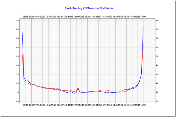
To average out all the stocks, a volume and turnover distributions graph is:
The blue line is the turnover distribution, the red line is trading volume distribution.
Both of them showing a U shape, with a small spark after lunch. Busiest moment is first five and last ten minutes. The most quiet moment is after 13:05 and before 14:00, and momentum catching up after 3:00.
Divide these two data:
Interesting information is, typical stocks traded with a smaller price (usually small cap), are relatively more active between 11:30 to 12:00, and 14:00 to 15:00. At those periods, big accounts take rests and market relatively more focus on smaller caps, for examples:
Next Page


