- 股票掌故
- 香港股票資訊
- 神州股票資訊
- 台股資訊
- 博客好文
- 文庫舊文
- 香港股票資訊
- 第一財經
- 微信公眾號
- Webb哥點將錄
- 港股專區
- 股海挪亞方舟
- 動漫遊戲音樂
- 好歌
- 動漫綜合
- RealBlog
- 測試
- 強國
- 潮流潮物 [Fashion board]
- 龍鳳大茶樓
- 文章保管庫
- 財經人物
- 智慧
- 世界之大,無奇不有
- 創業
- 股壇維基研發區
- 英文
- 財經書籍
- 期權期指輪天地
- 郊遊遠足
- 站務
- 飲食
- 國際經濟
- 上市公司新聞
- 美股專區
- 書藉及文章分享區
- 娛樂廣場
- 波馬風雲
- 政治民生區
- 財經專業機構
- 識飲色食
- 即市討論區
- 股票專業討論區
- 全球政治經濟社會區
- 建築
- I.T.
- 馬後砲膠區之圖表
- 打工仔
- 蘋果專欄
- 雨傘革命
- Louis 先生投資時事分享區
- 地產
Random Tags
Ztrader – the Data 港股博弈
http://clcheung.wordpress.com/2013/10/01/ztrader-the-data/Oct 1, 2013
Recently busy in developing a new TA system, named Ztrader, which targets high performance, fast new indicator development, fast real-time scanning, portfolio management and etc. Later I will share more about this new system’s capability and new features.
===
The Data
Ztrader is the 3rd system I developed for stock trading. The reason to develop my own system was backed to few years ago. I’ve attended Mr Sky Cheung’s training course, at that time, my TA knowledge was zero and I was a “simple FA” guy. The course did only teach very basic TA skills which likely you can learn by yourself from reading several TA books in library.
As discussed previously in http://clcheung.wordpress.com/2012/06/09/%E7%B3%BB%E7%B5%B1%E6%96%B0%E5%8A%9F%E8%83%BD%EF%BC%9A%E7%B5%82%E6%A5%B5%E5%9C%96%E8%A1%A8%E5%8A%9F%E8%83%BD%E6%9B%B4%E6%96%B0/
in 除淨因素, the dividend effect was not count in most free service providers.
The first good thing I learn in the course was : TA system depends on good data. The software using at the course was Metastock, which is a simple to use software for beginner. So I subscribed Metastock data from a local vendor. Unfortunately, the data provider regularly gave wrong data in a delayed manner. It was frustrating. Also, I was trying to build cross market data functions, like sectors and market indicators, which seems not easy to do so at that version of Metastock. Metastock’s capability also imposed quite a lot of limitations and it was difficult to program complicated indicators in the environment. (I am not sure if the latest version of Metastock has any improvement.)
Although my system seems fixed the data issue, which I do ex-dividend, split and merge, and stock code migration, ex-right, board switching, etc., properly. The data issue is still not completely solved. Re-quote the example here:
最後再談談除淨因素。先看題目是有一個股票大派股息:
Day 1: 股價 $95
Day 2: 股價 $100 股價上升 5%,+$5 (5.26%)
Day 3: 股價 $10 ,因為派息 $90
Day 4: 股價 $5 股價下跌 50%, -$5 (-50%)
How to handle this dividend payout is complicated. Now consider again another example:
Day 1:
Close $100
High $105
Day 2
Price +$1
Close $101 +1%
High $106
Day 3
Pay $50 Dividend, Price close at $51
Close $51 0%
High $56
Day 4
Price +2
Close $53 +3.92%
High $57
Day 100
Price from Day 5 to Day 100 +$53
Close $103 +100% relative to Day 4
High $110
Day 101
Pay $100 dividend, Price close at $6
Close $6 +100%
High $7
This stock totally paid $150 dividend. If the dividend is not excluded from the historical stock price, all TA indicators will be useless. If dividend is excluded from the historical stock price, you will see the historical price goes below zero. This makes quite a few indicators failed or information changed. For example, the ROC indicator. Failing means back-testing of the effectiveness of the indicators or any trading system failed.
To deal with the situation properly, a new delta adjusted method will be used, which worked like the current “price comparing” function. This delta adjusted method assuming the dividend of a stock can be re-invest on the stock immediately. Not 100% correct, but makes the system more practical and almost any indicators will be functioned as expected.
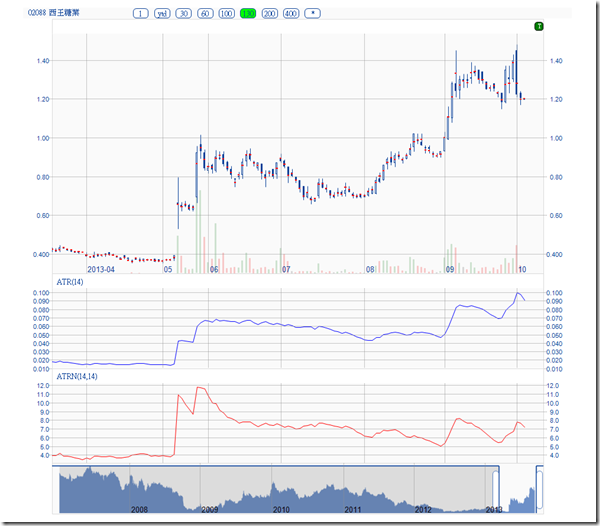
To illustrate with a practical case, consider 2088 this year, it paid 0.75 sp dividend on July 4:
from Google:
Definitely the chart is not helpful, it only tags a special dividend there.
from aastock:
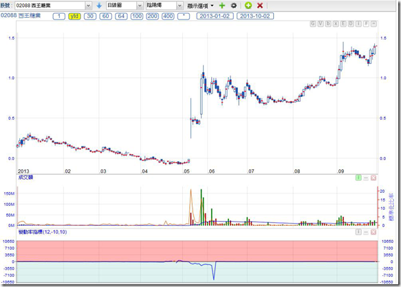
the chart data seems correctly ex-dividend. However, the ROC indicator got confused. Also, aastock system does not showing negative prices.
From my existing stockmaster system:
same problem as in aastock, ROC indicator is confused.
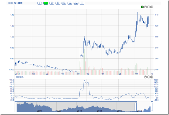
In the new Ztrader system, the data is delta adjusted accordingly, instead of one-off ex-dividend:
ROC is correctly displayed. The rate of return on this stock can be much better calculated in this system.
In fact the Stockmaster or aastock ex-dividend method changes also the historical volatility. The candle height relative to the closing price are amplified by the ex-dividend effects.
Ztrader – Swing Filter , M and W pattern 港股博弈
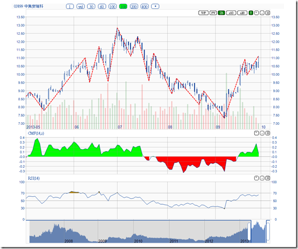
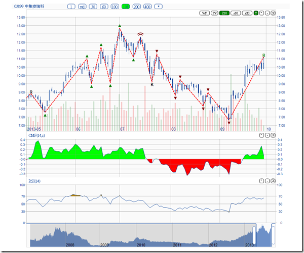
http://clcheung.wordpress.com/2013/10/02/ztrader-swing-filter-m-and-w-pattern/Let’s look at # 3899. It was peaked on early July and suffered from a major correction. Fundamental of the company seems not much changed but the correction was deep.
From the CMF (Chaikin Money Flow) indicator, obvious money flowing out from mid-July to end Aug. Painted in red color.
Now put in a Swing filter, which set to 10%, the peaks and bottoms can be seen on the red doted lines:
There are ways of trading pure relying on the swing filter. To ride on the uptrend from May to July, one can enter the bets by catching the low swing line, until the trend was broken in mid July (no more higher highs)
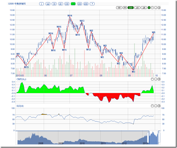
Or, to make it more sophisticated, here Merrill’s M and W pattern http://www.bollingeronbollingerbands.com/patterns/ , provide more hints on the swing lines by marking it with M and Ws.
While it is complicated to look up the meaning of these M and W code, it can be further translated to symbols:
The green triangle indicates a bullish swing, the red inverted triangles indicate a bearish swing. And the July 12 double arc, indicates a head and shoulder pattern, which is usually bearish.
The swing points can be used together with other trading techniques, for example, adding a RSI divergence indicator:
On June 28, the new peak has a RSI value lowered than that on June 18, which is graphically shown as a dark red dot line. It is a bearish divergence. Not a very strong selling signal but worth to monitor.
Combining the divergence, M and W pattern with a head and shoulder, and CMF go negative, one may be able to identify an escape opportunity early enough.
In fact the Swing filter shall be very useful to combine with other indicators to form a trading system.
Ztrader – We need Turnover 港股博弈
http://clcheung.wordpress.com/2013/10/03/ztrader-we-need-turnover/
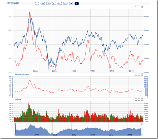
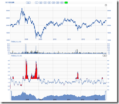
The above chart plots the SMA 20 of the market turnover overlaying on HSI. The index movement has a strong relationship with the market turnover but it is not linear.
If plot in log scale, the relationship is much better shown.
Before 2007, the market turnover was quite low, which is not shown in the above chart. But since beginning of 2007, the market turnover was increased significantly, till the peak of the direct train speculation.
In May 2008, there was an index rebound but overall turnover did not follow. The index collapsed after that. In Nov 2010, there was a turnover peak to support the index, after that, turnover went down, market collapsed. In May 2013, it happens again.
In recent years the turnover was unexpectedly low and seems on a downtrend now. It seems not about to support a higher index at this stage. With the current turnover, the index support level shall be around 20000.
In fact it is quite strange that over the last 6 years, the market average turnover is getting smaller, while we have had many new companies got listed already. The extended trading hour does not help much; the lowering of commission fee does not help much neither.
If those stupid MPF funds do not buy buy sell sell in the market, how come their performance is so low ? If they do buy buy sell sell in the market, how come the overall market turnover is getting smaller ? It is a real mystery.
Ztrader – if history repeat itself 港股博弈
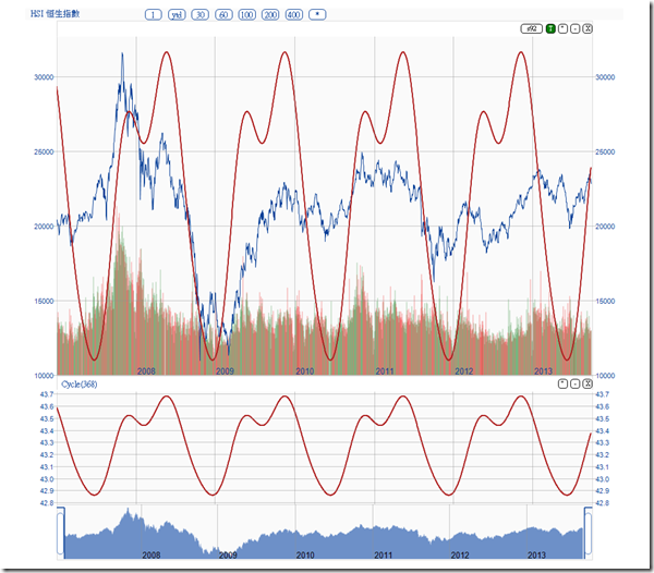
http://clcheung.wordpress.com/2013/10/04/ztrader-if-history-repeat-itself/Last year, I’ve posted a cycle theory on HSI : http://clcheung.wordpress.com/2012/09/23/hidden-cycles
While I have not adjusted the cycle length as far, here is an updated diagram:
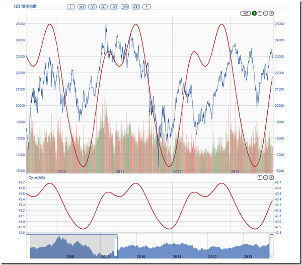
To make it clearer to see, zoom in a bit :
It seems the cycle is still in effect. Good news is, if history repeats, HSI has passed the bottom and started a new cycle already. It is on a uptrend.
However, even a cycle really exists, the top and bottom of the cycle may be drifted from the predicted time frame by months. As one may expected there usually deep V at the market collapse bottoms, drifted by such a scale means that the cycle is not that useful.
But since the cycle length is about to be 368 days, a 92 day moving average can be used as a trend trading signal to capture the major wave:
But if the market goes higher, the current turnover seems not enough. Either the index goes sideways and MUPI turn strong, or new money flow into HK to support this cycle.
You can argue that the historical data is not enough or the recent movement seems not fitting well the cycle lines. I have doubts too. It seems the recent price movement indicates the cycle length is widen a bit.
Well, it is a believe it or not theory. Let’s see.
Ztrader – Volatility (1) 港股博弈
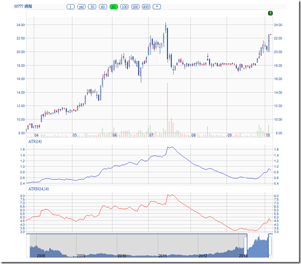
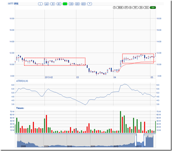
http://clcheung.wordpress.com/2013/10/06/ztrader-volatility-1/Volatility means trading opportunities. One of the famous indicator is Actual True Range, which is easy to construct and understand, for example, # 0777, consolidated for a while and up break the box to make a good advance:
The above chart showing two ATR. The ATRN is a normalized ATR with the SMA of the closing price. Because ATR is an absolution term, it means that you can’t compare one with another. For example, HSI ATR is usually a few hundred points; ATR of # 0777 is $0.5 to $1. ATRN can be used for comparison and for other trading algorithm’s building block.
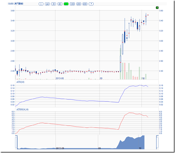
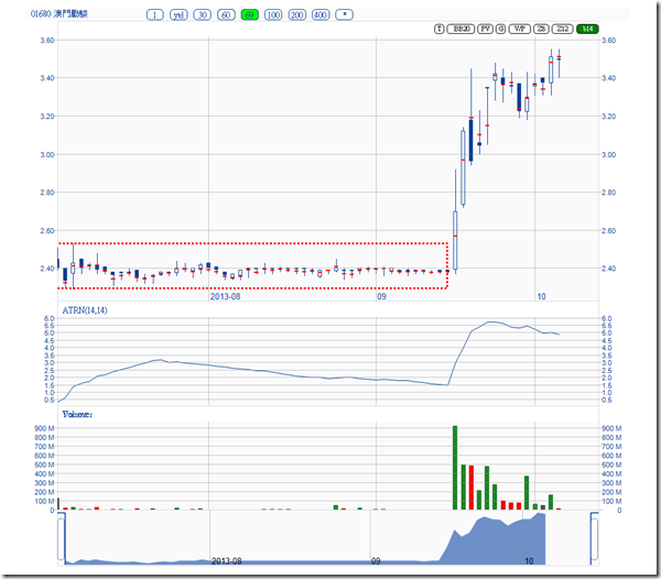
Here is another example of box up break, where ATR shoot up shapely:
Among the various chart pattern, box breakout is one of the most powerful. ATR can be used as a building block to construct such indicators.
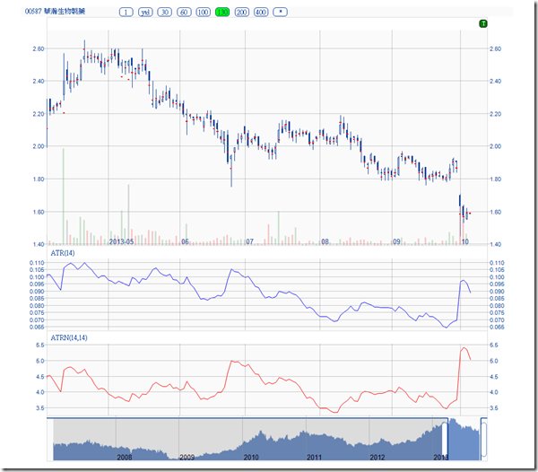
A collapsing example:
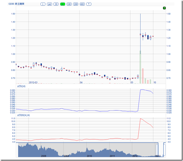
The ex-dividend effects on ATR indicator is none, if aastock’s old method is used. However, if you construct a normalized ATR, the effect is large in special cases, like 2088 this year:
Here is the old method:
The new method before and after the big dividend payout: Note that the normalized ATRN is not affected in the new method.
There are quite a few trading system based on volatility. Definitely ATR is a useful building block for those systems.
Volatility mean opportunities and risks at the same time. Another use of ATR is to control the bet sizes for future / options trading. Some recommend to use ATR for setting cut loss price points in options trades. It is also useful to measure the overall volatility of a portfolio. Will talk about it in portfolio management later.
Ztrader – Box indicator 港股博弈
http://clcheung.wordpress.com/2013/10/07/ztrader-box-indicator/Oct 7, 2013
In various trading patterns, I think the Box pattern is the most simple to understand and yet most powerful.
In this example, this stock’s ATR reducing gradually and at the up break point comes with a huge volume. Certainly the best example we can find this year.
Although it looks like it is easy to capture the box break out, actually it is not. Look at # 777 recently:
On Aug 19, the volume increase with a fake up break, and the closing restored to the previous box range. Later on, the momentum pick up and ATRN goes upward, a real up break occurred. The technical difficulty on the implementation side is the fake up break or down break which may affect your assumptions of the definition of a box. You may get confused at the fake up break and down break points. Entering or leaving at wrong and fake break point is common.
In Apr this year, # 0777 had demonstrated a box down break. But this stock is strong, it recoved with a high volume and get back to the previous box trading range after a few weeks:
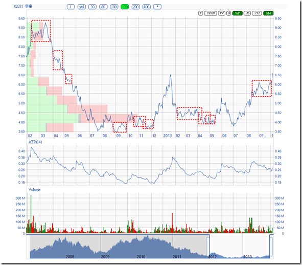
Sometime Boxes formation indicates the stock is entering a different trading range:
So it can combine with other indicators to confirm the trend. For example, after Sep 16, box up break with a high turnover, , # 0980 is traded on a new range. Aug 28 is confirmed as an inverted head and shoulder, CMF and momentum is healthy, today high turnover up break (the green dotted line is the PV resistance line extended from the last peak):
Ztrader – Multiple timeframes trading 港股博弈
http://clcheung.wordpress.com/2013/10/08/ztrader-multiple-timeframes-trading/Usually we have our own set of favorable indicators that we use from time to time. However, sometimes we would like to apply different indicator sets to examine the stock in different way. It is troublesome to do this indicator configurations from time to time.
The Triple Screen Trading System http://www.investopedia.com/articles/trading/03/040903.asp , suggest that we shall view a stock in multiple timeframes, and apply different set of indicators on each timeframe to make a proper trading decision. I believe the Triple Screen Trading System makes a lot of sense. Reading short, intermediate and long term chart shall be a step one for stock analysis (although I did not do so in the past). To make such multiple timeframes view and comparison, it is quite time consuming.
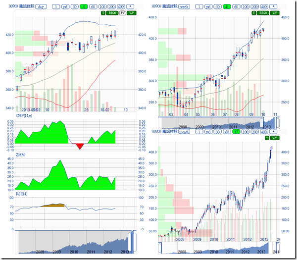
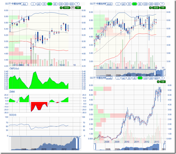
Ztrader charting system is re-designed for fast switching between indicator sets and also display multiple timeframes at one click:
# 0980 hoping for a new trend started:
# 0700, it is not a good idea to short this stock while 3 trends are moving in the same direction:
# 1177 , may indicate a buy opportunity at the recent corruption event:
Ztrader – Price Distribution Indicators (1) 港股博弈
http://clcheung.wordpress.com/2013/10/12/ztrader-price-distribution-indicators-1/To determine the support and resistance area, one method I like to use is to collect the statistics of the price distribution and display it visually on a chart.
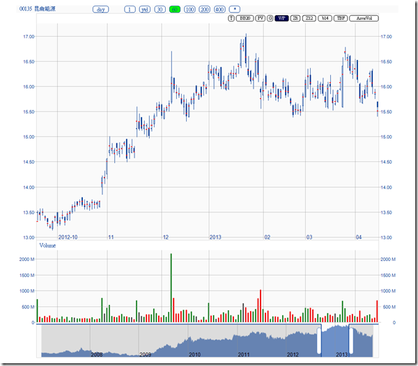
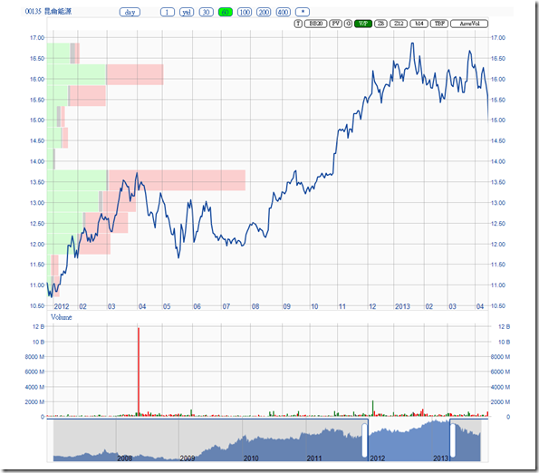
For example. # 0135 this year, before it collapse next day:
One can draw a support line a about $15.4. Is this support strong enough ?
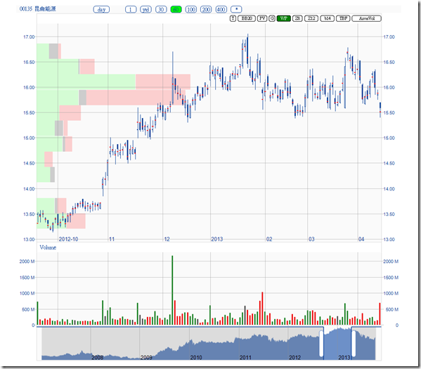
Turn on the Volume by Price indicator, the trading volume of the corresponding price level is accumulated and displayed as an overlay on the chart. Longer the bar, means bigger the trading volume at that price level. Green bar is the volume that closing wih a upward price, pink bar is the volume that closing with a downward price :
One can clearly see the region 15.66-15.95 , is dominated by the pink bar, which indicates an resistance more that a support, more than that, the lastest closing is below that region.
The support region from $13 to $15.6 is very weak, observed from the short Volume/Price line.
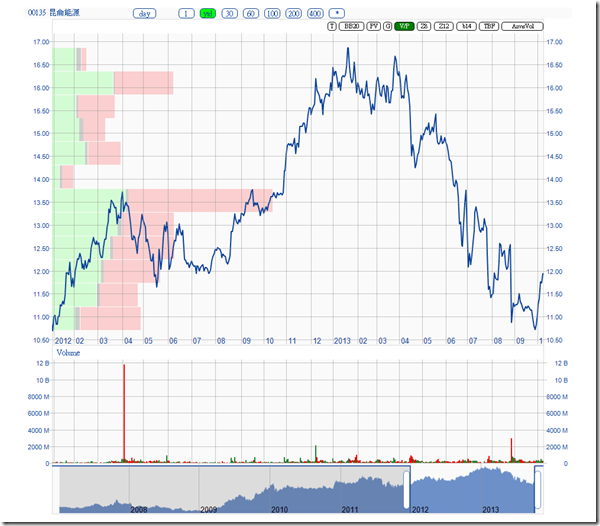
Extend the chart backward to 2012, the major support seems at $13.5.
In the case, it is better to escape rather than bet for a rebound. Follow that day, It collapsed and tried to rebound later:
Later it fall through the major support at 13.5:
Re-examine the major support at $13.5, There was a placement in 2012. If exclude that placement, support at $13.5 is not that major:
In fact the 857 corruption event was disclosed in late Aug. It seems a lot of related party already knew the investigation much earlier. The stock price stabilized after the event disclosed. If play this stock based on limited FA resources, it is a real disaster.
BTW, I am not challenging FA by TA. It is just the imbalance of information makes a pure “FA” analysis failed. Stock market is never a fair game.
Ztrader – Market Breath Indicators (1) 港股博弈
http://clcheung.wordpress.com/2013/10/14/ztrader-market-breath-indicators-1/
Oct 14, 2013
Market Breath indicators attempt to guess the direction of the overall market by analyzing the number of stocks advancing relative to the number declining.
Arms Index, called also TRIN, the Trader’s Index, created by Richard Arms, measures the market breath by:
TRIN = (Advancing Stocks / Declining Stocks) / (Advancing Volume / Declining Volume)
When it is below 1.0, the market is considered as bullish. When it is above 1.0, the market is bearish.
Here, the plot of TRIN since 2011:
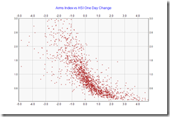
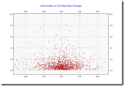
Arms Index against HSI one day change, from 2007 to Oct 14, 2013:
It shows some extreme cases, where TRIN values can shoot up to abnormally high during very bearish market.
If zoom into the “regular” and normal range:
The center of the chart is about at (0.0, 1.0), which indicate when HSI index is no change, TRIN shall be around 1.0. The relative empty areas in upper right and lower left in the chart, indicates the effectiveness of the indicator is confirmed.
Here is the distribution of TRIN between 0 to 3.0 :
The chart shows a more than neutral view. The median value is 0.85, indicates in general the market is on a slightly bullish side.
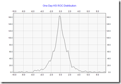
Here is the one day HSI change distribution:
The chart shows a very neutral view. The median value is 0.056%, indicates in general the market is on average very neutral.
If there is a relationship between TRIN and HSI, I would say the neutral point of TRIN value is 0.85 instead of 1.0.
===
Then how about MUPI distribution ?
The median value is 0.175%. In fact I think TRIN is more correlated to MUPI.
How about TRIN vs MUPI one day change:
Still not easy to read.
===
Prediction Power of TRIN
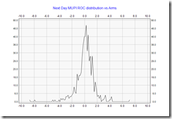
How about using today’s TRIN to predict next day’s market direction ?
Seems no useful relationship.
If only consider TRIN value < 0.6 (a bullish day), plot against the next day performance:
HSI gain is about 0.028%, almost zero prediction value.
If uses MUPI:
Average gain is 0.18%, median 0.27%, better than HSI.
In conclusion, Arms Index is more related to MUPI than HSI. It makes sense. A bullish day indicates the next day shall be a bit bullish also. It has no one day prediction power with one day Arms Index on HSI.
==
While it seems the prediction power of TRIN for next day’s trading is not much, Arms suggested a moving average of TRIN can be used to pick bottoms and tops for the market. Here a 21 days moving average is used and oversold level set to 1.5:
The peaks seems shifted a bit. MUPI version is better :
Except on 2007, the recent lows of the market is quite accurately captured. One can enter the market after the moving average leaves the red zone.
It seems more difficult to predict market tops using this indicator.
In conclusion, it is an effective tool to help locate the market bottom for MUPI rather than HSI.
Ztrader – Moving Average (1) 港股博弈
http://clcheung.wordpress.com/2013/10/15/ztrader-moving-average-1/The Guppy Multiple Moving Average (GMMA), using two groups of EMA lines to help visually identify the trend and trading opportunities:
The green lines are groups of shorter period EMA lines, and the red lines are groups of longer period EMA lines. When the stock is on a clear uptrend (or downtrend), these lines will be aligned in order and go in parallel. When the trend changes or the stock price consolidates, these lines will be merged or crossed.
It looks nice. However, GMMA itself does not give extra information more than a group of EMA lines. It is also not useful for setting up automatic trading rules. It is only a nice visual tool to help making trading decisions. e.g. jump on a strong stock when the GMMA lines merged at price consolidation, ride on a stock when GMMA lines aligned and goes parallel.
Next Page


